Projektbeskrivning
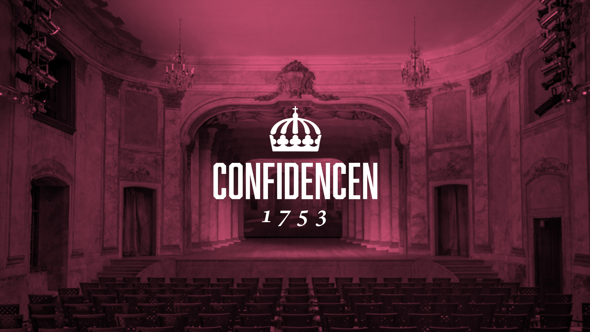
Redesigning Sweden’s oldest rococo theatre
Creative direction
Art direction
Final Art
Confidencen’s visual identity had been left untouched since 1976 when Swedish opera singer Kjerstin Dellert saw the old royal theatre’s charm and decided to take it upon herself to restore it to its former glory. In 2017 it was time for a face lift that walked the fine line between respecting the institution’s more than 250 years old heritage while attracting a new, younger audience.
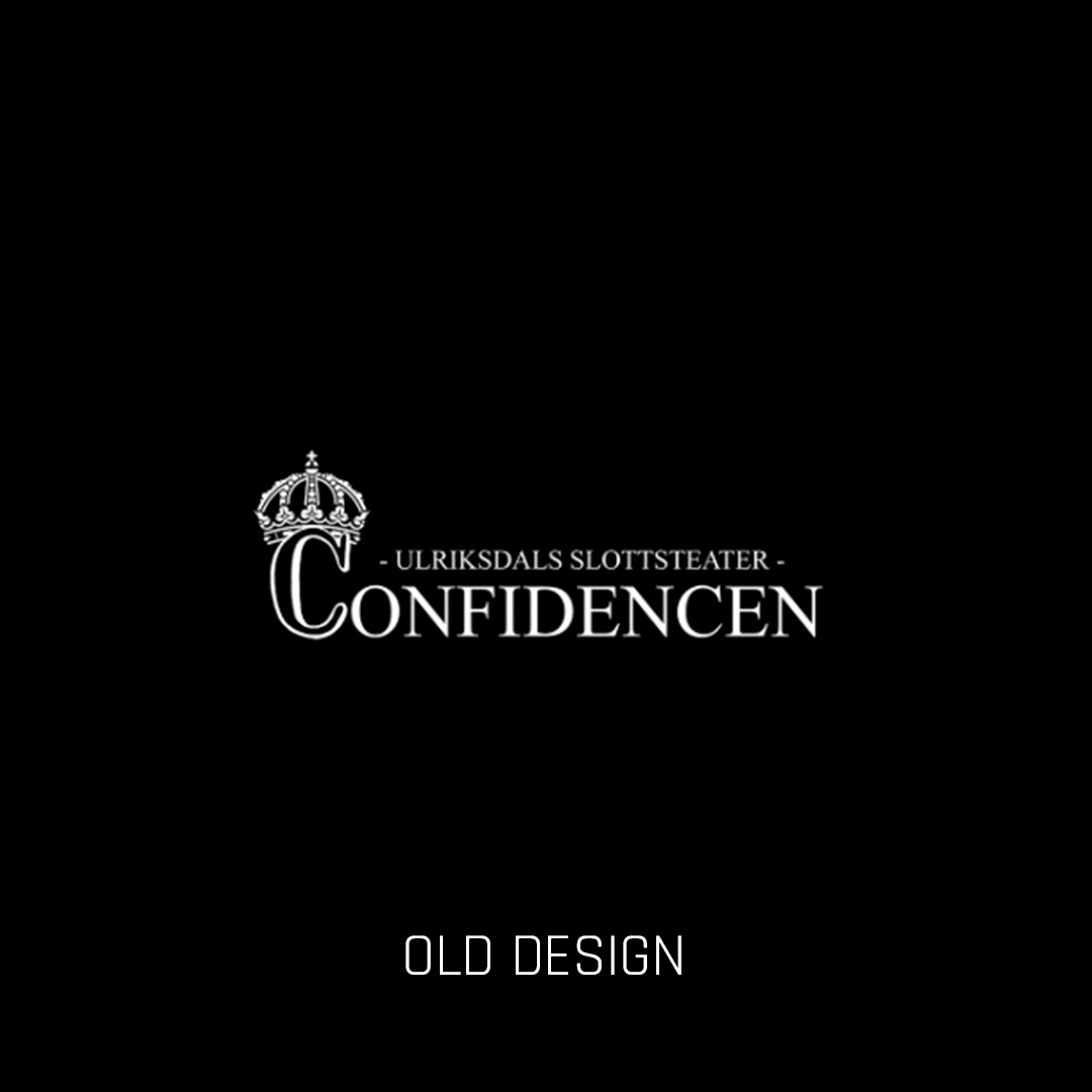
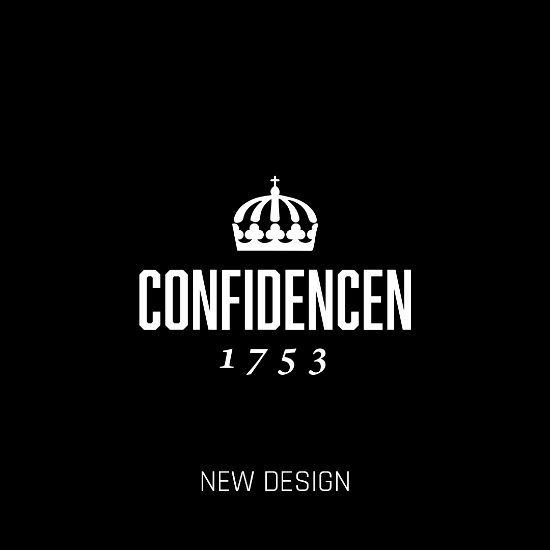
The logotype consists of three components. The royal crown that has been part of the identity for a long time – but now in a cleaner, slightly stricter form that’s optimized for digital screens. The name Confidencen – with prouder, more modern typography. And finally the year when Confidencen was established – written in Sabon font, originally drawn on the classic Garamond to further emphasize the old French inspiration.
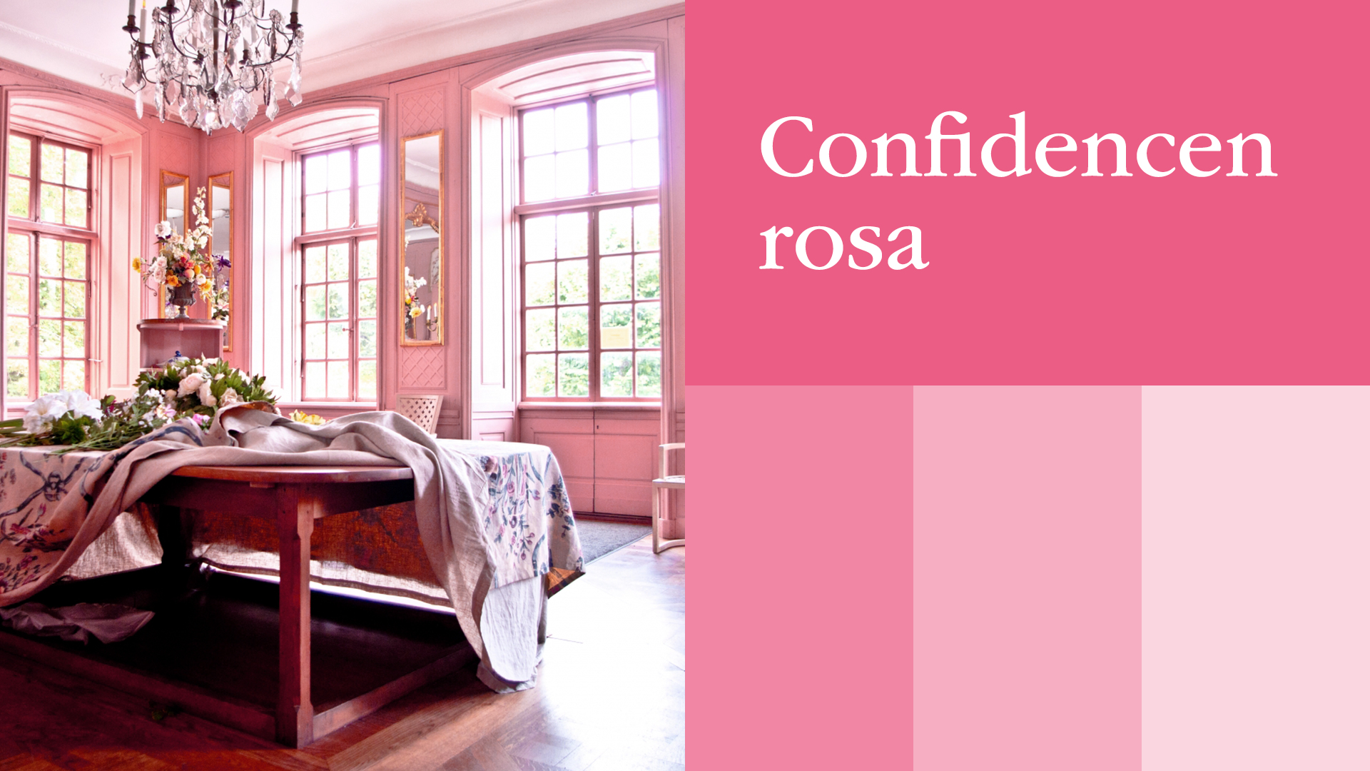
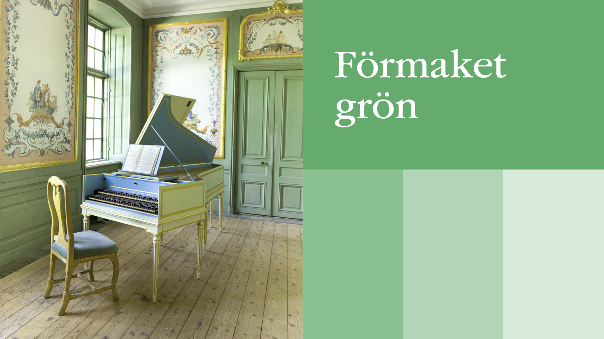
The color palette is a mix of modern interpretations of 18th century colors – which can be found in the beautiful rooms at Confidencen. We picked up the pink from the Confidencen Room, the theatre’s chambre separee, and the green color from the atrium that hosts the century old cembalo.
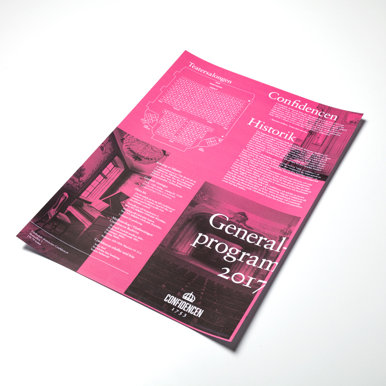
Using Garamond as the main font you can still see a connection to the old French visual world that inspired the birth of Confidencen. When using the font in the offset grid, playing with text running into the bleed area gives the layout a feeling of belonging in the 21st century.
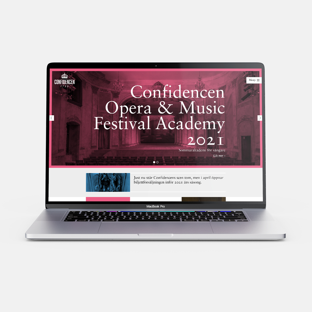
The website got a much needed facelift, both in terms of design but also functionality. The older audience still made their reservations over phone after looking in the physical schedule, while the newer audience was in need of a digital list of upcoming events connected to an online booking service.
The older audience needed to feel safe in using the website to get their tickets and plan their event which meant that the design needed to be simple and accessible while still feeling modern.
